
In the current business intelligence market, visual display of data is one of the big-ticket items that customers are seeking. People want eye-catching and easy-to-use graphs, dials and dashboards.
And being a data nerd, at first I found this odd. What can a chart or a dial tell you that the raw data driving that visual can’t? Why not just look at the data and get all of the detail in the first place?
Since then, I’ve realised that what is driving the interest in the visual display of data is the need for a top level view.
Take the below picture, for example:

There’s a lot of detail — right down to individual rocks and dirt. But what’s it a picture of? If we followed the paths in the dirt, we eventually might figure it out…or maybe we’d just see a lot more rocks and dirt.
But if we take a higher view, we get the big picture in a glance.

A well-constructed dashboard with the right metrics can give you that top-level view of your business, enabling you to see at a glance what’s working and what’s not. With the right dashboard, you can just drill down and concentrate on the detail as the problem areas, instead of wading through all of the rocks and dirt trying to figure out what is it you’re seeing!
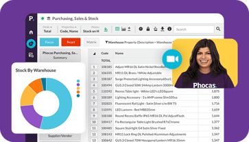
With Phocas, you have the ability to create an awesome dashboard on anything that you have data for. One particular area this is useful is for customer and vendor scorecards.
A customer scorecard gives you a single place to look when you’re talking with your customers. Imagine, just before you walk in for customer review, you bring up a scorecard that will show you:
- How their overall sales are going this year vs last year,
- What they are buying more of and what they bought less of
- Their payment history and even
- How all of those other metrics compare to others in the same industry.
Now if in the process of the customer review they want more detail about something you raise, it’s an easy click through to the data behind the widget right down to the invoice level. Your customers will be impressed (and maybe a little shocked) at how much you can tell them about them.
The same method of dashboarding can also be used to create a scorecard for your vendor/suppliers. At a glance, you can see;
- What you bought and sold from them,
- What your top moving and slow moving items are from that vendor
- The margin you made on their products and
- Actual average lead time compared to what was promised.
Right there in a single screen and in easy-to-read graphics, you’ll find everything you need to help negotiate your next deal with that vendor.
The best thing of all is that with Phocas, customer and vendor dashboards are not only easy to use, they’re easy to create too.
So the question is—are you getting a top-level view of your key data, and if not, why not?

Craig is an expert in data analytics helping customers determine specific data requirements so they can enhance performance, productivity and confidence.


Find out how our platform gives you the visibility you need to get more done.
Get your demo today