This video shows you how to get the most of the summary button. It's a feature that is sometimes overlooked, but watch to see how just how useful it can be.
Use a summary chart to turn a favorite into a simple color-coded dashboard widget. See Andy's 'Summary charts 1' video in the Charts module to learn how to create a summary chart widget from scratch.
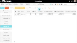
In this video Tim shows you how to compare a market segment to the overall market using market mode. Learn how to define a market and a segment and how to speficy what entities you want to count and compare.
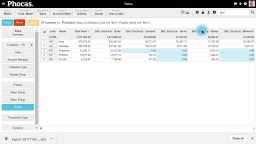
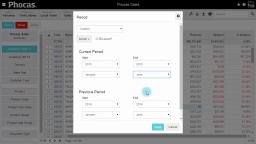
Learn how to switch to variance mode and see where results are improving (or not going so well). We show you how to customize the date range, compare periods and jump from customer to product or any other dimension.
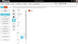
2:27 min
We use cookies!
By clicking "Accept all", you agree to the storing of cookies on your device to enhance site navigation, analyze site usage and assist in our marketing efforts.
Privacy preference center
When you visit any website, it may store or retrieve information in your browser, mostly in the form of cookies. This information might be about you, your preferences or your device and the primary purpose is to ensure the website functions as you expect it to. While this information typically doesn't directly identify you, it contributes to a more personalized browsing experience. Because we respect your right to privacy, we provide the option to control certain types of cookies. Click on the different category headings below to learn more and modify our default settings according to your preferences. However, blocking some types of cookies might impact your experience of the website and the services we are able to offer.
These cookies are necessary for the website to function and cannot be switched off in our systems. They are usually only set in response to actions made by you which amount to a request for services, such as setting your privacy preferences, logging in or filling in forms. You can set your browser to block or alert you about these cookies, but some parts of the site will not then work. These cookies do not store any personally identifiable information.
Functional cookies
These cookies are necessary for the website to function and cannot be switched off in our systems. They are usually only set in response to actions made by you which amount to a request for services, such as setting your privacy preferences, logging in or filling in forms. You can set your browser to block or alert you about these cookies, but some parts of the site will not then work. These cookies do not store any personally identifiable information.
Performance cookies
These cookies allow us to count visits and traffic sources so we can measure and improve the performance of our site. They help us to know which pages are the most and least popular and see how visitors move around the site. All information these cookies collect is aggregated and therefore anonymous. If you do not allow these cookies we will not know when you have visited our site, and will not be able to monitor its performance.
Targeting cookies
These cookies may be set through our site by our advertising partners. They may be used by those companies to build a profile of your interests and show you relevant adverts on other sites. They do not store directly personal information, but are based on uniquely identifying your browser and internet device. If you do not allow these cookies, you will experience less targeted advertising.