Configure the chart options
3:27 min
See how to change an axis starting point (using auto-axis scale), stack the chart values on top of each other rather than side by side or select and focus on a segment.
Supporting documentation
Phocas product  Analytics
Analytics Category

Related video tutorials
 Flex Modes
 Copy or export data
Learn how to copy or export data from the grid when you want to continue working with it outside Phocas. See how to copy selected cells or rows into a spreadsheet, or export a wider set of data as a CSV or XLSX file. You’ll also see how Excel exports retain features such as conditional formatting and nested rows, helping you carry more of your current view into Excel.
1:47 min
 Flex Modes
 Create a nested view
With the nest view feature in Flex Modes, you can add dimensions as levels in the grid, making your data easier to interpret. This lets you see how different items contribute to the overall results and build reports where you define the hierarchy of the data on display.
1:52 min
 Flex Modes
 Apply conditional formatting
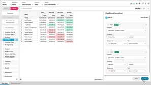
Learn how to use conditional formatting to quickly highlight key values in the grid. In Flex Modes, you can apply rules that change the text or background color based on cell values. It’s a great way to make trends and outliers stand out without needing to sort or filter.
2:37 min
 Analytics
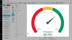
 Create KPI-style gauge, summary and bullet charts
Discover how to track key performance indicators using KPI chart types in an Analytics database. In chart view, explore Gauge, Bullet, and Summary charts to visualize business goals and targets, ensuring performance insights are clear and easy to monitor.
3:25 min