Four opportunities with data visualization tools for the road back

“Without big data, you are blind and deaf and in the middle of a freeway.” Geoffrey Moore, American organizational theorist said this 15 years ago yet managers continue to operate without full visibility into their data and have felt the limitations during the crisis. From online sales to CRM data to accounts receivables, we constantly accrue data in business. However, this data is a burden if we can’t access and harness it quickly. Data visualization tools can help business managers take advantage of the opportunities that lie within their data, be flexible and respond faster.
Like any form of information, data is only as useful as the ability to understand and communicate it. Effective communication goes beyond what we say. It’s also about the way we say it. Data visualizations are tools that aid this communication by transforming complex information into graphic representations. When we can visualize data in the form of charts, graphs, or maps, it’s easier to see relationships, uncover patterns, communicate insights, and make data-driven decisions. Communicating through visualizations stimulates viewers’ brains, enhancing the impact of the information and allow people with different responsibilities share insights. Factors such as color or shape are visual cues that attract viewers’ attention, expedite comprehension and enhance retention and recall.
4 opportunities with data visualization
1. A gauge to visualise 7 day and 14 day variance
A gauge chart is typically used to visualize data containing a comparison or variance, such as sales vs. budget or data this month vs. last month. Currently business managers are using gauge charts to visualize daily and weekly changes to their business. A gauge is also used to count the number of something, such as the total number of sales this week. Gauges can be used to monitor things like the performance of customer account managers. In this example, a manager can add three data points such as total sales, x product, x week. In a radial gauge, the needle might represent the new weekly goal. A manager can now use the gauge on their dashboard to see whether the team is meeting its revised targets. This allows the manager to intervene and offer the guidance a rep might need to reach their weekly goals.
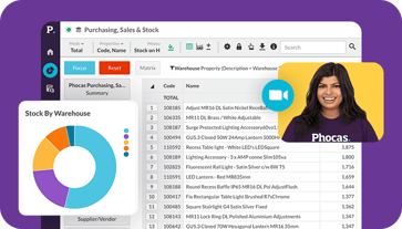
2. Bullet chart to respond to purchasing declines
Bullet charts are considered to be one of the most effective types of graphs and are often described as a secret weapon for efficient analysis. This relatively new type of chart is seen as an advanced form of traditional chart systems, as it does away with extraneous details. Bullet charts are great for individuals who want all of the information in one place without having to compare different visualizations.
Bullet charts are best for visualizing key performance indicators (KPIs) that compare actual results to forecasts. As many executives know, the success of a company depends on how well they can respond to fluctuating customer needs. A bullet chart can be used to track customer purchasing behavior against targets to detect a purchasing decline. This information gives the company an opportunity to respond. The sales team can address the customer’s changing needs by recommend a better product mix or introducing a line of products in stock. The beauty of the bullet chart is that it is easy to understand and offers accurate information at-a-glance without confusion.
3. Heat map to deal with seasonal fluctuations
A heat map is a visualization in which the area inside defined boundaries such as states, counties, or regions, is shaded in proportion to the data being represented. The hotter the color (i.e. heading towards red), the higher the number in that general vicinity. Heat maps can be used to represent things like population density, average temperatures, per-capita income, and many other geographically relevant measurements. In business, heat maps are perfect for representing data such as where customers are, and what stock is on hand. For example, a pool chemical supply company might use a heat map to monitor the number of pools on the west coast of the United States. If there is a heatwave predicted across certain weeks, the company has the opportunity to have enough chlorine or chemicals on hand to sustain the increased demand.
4. Bubble chart to understand productivity
So far, we’ve discussed visualizations for displaying two dimensions of data. But what if we have a third or fourth? Meet the bubble chart. This versatile visualization can be used to see three variables in one easy-to-understand chart. In its simplest form, the bubble chart communicates a numerical value visualized by the size of circular bubbles, and a second variable is represented by what each bubble represents. In other words, larger bubbles equal larger values. Combining different-sized bubbles with the x and y-axis provides a third dimension of data. For instance, a sales manager can use a bubble chart to review sales reps by margin, sales revenue, and activity. The first measure (margin) would be plotted on the x-axis, the second measure (sales revenue) would be plotted on the y-axis, and the third measure (activity) would determine the size of the bubble.
This bubble chart might show that a sales rep is earning good margins, but their sales activity is low. Managers can use information as an opportunity to meet with the rep to offer motivation, set clear goals, and celebrate achievements. Also, individual reps can monitor their performance to see how they are doing in relation to their teammates. This can promote friendly competition and provide an opportunity for teammates to motivate each other to meet a team goal.
Without the ability to understand your data, identifying opportunities is time consuming and difficult. The good news is that you can create effective visualizations straight out of the box. A BI solution like Phocas enables all users to create a customized dashboard with a range of charts to make the most of your data.

Empowering businesses with intuitive data analytics, driving informed decisions for growth and profitability. We make people feel good about data.
Related blog posts

For many businesses using an Oracle NetSuite ERP, financial and operational reporting often starts at a high level - total revenue, cost of goods sold (COGS) and operating expenses. But relying solely on this aggregated view is like trying to drive with a foggy windscreen. Without the ability to drill into specific transactions, blend financial and operational data, and visualize the root causes of performance trends, businesses are flying blind.
Read more
For mid-market leaders running a wholesale distribution business, data and business intelligence technology are crucial for monitoring financial and operational performance. However, the real value lies in how your team uses the data insights to influence decision-making.
Read more
Preparing effective board reports cannot be underestimated. They’re not only essential for communicating financial performance and operational progress, but are also an all-important part of strategic and intelligent decision-making.
Read more
Sales and operational planning (S&OP) helps businesses to align their strategic goals with day-to-day operations. By integrating financial planning with operational and sales planning, S&OP ensures that all departments work cohesively towards common objectives. This process operates on strategic and tactical levels, providing insights that influence long-term decisions while guiding day-to-day actions. Understanding the dual focus of S&OP is essential for creating a robust plan that addresses immediate needs while positioning the company for future success.
Read moreBrowse by category
 Get a demo
 Find out how our platform gives you the visibility you need to get more done.
Get your demo today