How to build a dynamic dashboard and stay on top of your KPIs
If a picture can paint a thousand words, how many is a dynamic picture worth? A lot of words, according to business owners, sales and purchasing professionals who use dynamic dashboards regularly.
Among the biggest challenges for business managers is wading through the massive amount of information generated across the entire company. Smart companies bolt-on business intelligence software to their ERP which syncs all the data into a single source of truth.
Business intelligence software such as Phocas, helps users uncover the data insights that drives their business and present the findings in dashboards, that can be easily built to meet the needs of your business.
Building dashboards
You don’t need to be technical to create a powerful dashboard in Phocas.
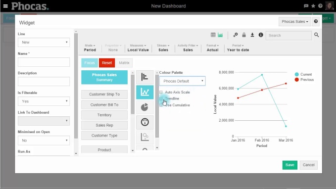
To build a dashboard in Phocas, you simply go into the dashboard area, name it and get started. You fill the dashboard by using widgets, these clever tools are the conduits to your data in the Phocas database. By clicking on the widget function, you are able to select from a number of in-built queries you may want to include in your dashboard. (e.g. Year to Date Sales Summary or Rolling 12 Month Sales by Customer Type). Once you select from hundreds of options, you then choose whether you want it displayed as a chart or graph and save.
You can create as many dashboards as you like, customize them and share them with other users. There are a number of ways to change the look and feel of a dashboard. Most of this customization can be done either while you are building a dashboard, or with an existing dashboard.
You can set your dashboard to update with any new data, either immediately or at selected intervals.
To view how simple it is to create a dashboard, view the video below.

Using dynamic and interactive dashboards
A variance catches your attention in the dashboard and you want to follow your train of thought, so you drill down into the underlying information to find out what is driving what you are seeing on the surface.
To make the dashboard ‘come alive’, you open the dashboard in Phocas that you are reviewing, maybe it is the Sales Dashboard which includes key metrics such as Current vs Previous Period Sales , Sales Pipeline, No Sales, Average Deal Size, Forecast Accuracy.
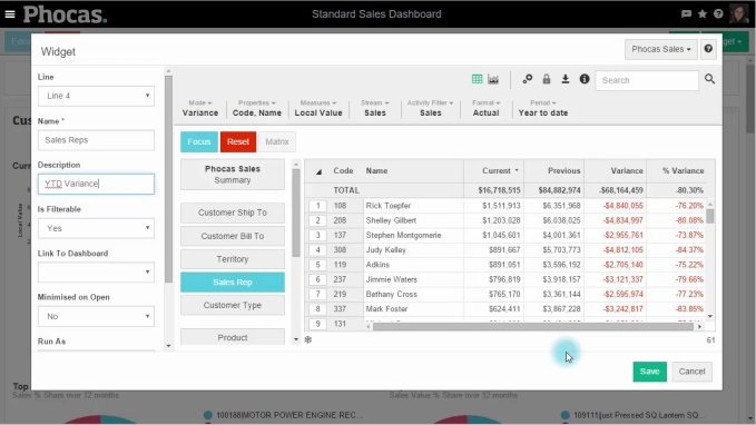
You decide that you want to see all the above metrics by a particular Sales Representative in the business, so you do this by adding a new widget and making it selectable. You go back to widgets, and then find the Sale Representative dimensions and add this. You can now view all the metrics from the perspective of each Sales Rep and send them specific recommendations directly to their email, so they can take immediate action.
To make your dashboard dynamic watch this video:

Information is power. With real-time access to the exact data you need, you make the best strategic, tactical, and operational decisions.


Empowering businesses with intuitive data analytics, driving informed decisions for growth and profitability. We make people feel good about data.
Related blog posts

Food and nearly everything else that is bought and sold must travel from where it is produced to the buyer. Transportation costs are rising sharply. Oil prices have surged by approximately 45% and gas by 55% since late February, a direct consequence of the escalating conflict in the Middle East. Distributors and their supply chain managers have been up against inflation and rising prices since the pandemic and and to cope with continuing shocks like the Middle East crisis most have had to change their supply chain processes to manage a more volatile marketplace. Business intelligence (BI) helps distributors understand risk exposure and make confident decisions when the range of possible futures runs from bad to considerably worse.
Read more
Inventory days formula is equivalent to the average number of days each item or SKU (stock keeping unit) is in the warehouse.
Read more
A CFO of a wholesaler recently described dead stock as piles of cash in the corner of a warehouse that she can’t access. And, in many ways, she’s not wrong. Dead stock is unsold products in storage or returned from retailers. It reduces the cash flow you need to buy revenue-generating stock and takes up valuable warehouse space that profitable products could use. Dead stock inventory also increases carrying costs, tying up resources in excess inventory that no longer matches customer demand.
Read more
DIFOT (Delivered In-Full, On-Time) or OTIF (On-Time In-Full) is a fundamental KPI when analyzing the performance of your supply chain. The main goal is to get your customers the products they need, when they need them, in the quantity they ordered. DIFOT measures how successful your business is at achieving this objective and identifies procurement problems and supplier reliability.
Read moreBrowse by category

Find out how our platform gives you the visibility you need to get more done.
Get your demo today