When decision making is so tough that even rocket scientists get it wrong
Typically, having loads of data is overwhelming for a decision-maker, unless it can be consolidated and presented in a way that is useful and makes a point. One of the communication lessons from the Challenger disaster in 1986 is the way unclear information provided to NASA, affected the decision to go ahead with the launch of the rocket. The horror of the catastrophe overshadows the story of how it happened. Academics and journalists tend to focus on the political or economic bias of the decision-makers as the root cause. Not on the data presentation, and how the critical factor of temperature and how it affects O-ring performance, was not made clear to the rocket scientists.
When data doesn't build credibility
NASA’s decision-makers had reams of data about the tenth Challenger mission but not in an easily accessible format. This situation caused them to rely on information provided by an external party. The night before the launch, contracting engineers were asked to prepare documentation on why they were recommending against the launch. They summarised more than 130,000 pages of information into 13 slides.
Tragically, as it played out, the 13 summary slides presented to NASA were so dense with engineering information that the pertinent facts were lost. The presentation failed to establish credibility or convince the highly capable NASA scientists not to launch.
Dr Edward Tufte, American statistician and Professor Emeritus in computer science at Yale, published four books about data visualization. He describes the series of books as 'pictures of numbers, pictures of nouns, and pictures of verbs.' In the third book, Visual Explanations, he examines the 13 Challenger slides in detail. Tufte argues if the contracting engineers had displayed their information better, the space shuttle disaster could have been avoided. He demonstrates how the slides created for NASA separated cause from effect, failed to establish credibility, and focused on the wrong problem. He shows how the data could have been displayed using a data matrix and a scatterplot to make it immediately apparent that the launch was extremely risky in temperatures below 66 degrees.
How to build credibility in your data
Tufte wrote the book when business intelligence and data visualization software wasn’t readily available. But what is interesting about his analysis of the situation is that he uses timeless guidelines that are at the heart of quality communication such as repetition, diagrams and narrative. Data is powerful, but it needs to be visualized to engage an audience. By presenting data in a visually engaging way, you enhance your story and your audience’s experience.
He recommends that data alone won’t necessarily make the desired impact you want. This is true especially if your audience can’t interpret the data, even if that audience is made up of NASA scientists.
Statistics might be relevant, but merely reading those numbers won’t always get the point across. Letting your audience see the data, by painting a picture explains what it means. This visualization increases understanding and recall, making a stronger impact.
What question do you want to answer?
A good place to start when you are preparing a visualisation is what question do you want to answer. As you dig into your data, you may find an entirely new or unexpected story, but it helps to have a starting point. Depending on the type of report you are creating, you may need to gather internal data from your ERP, CRM, e-Commerce as well as external sources. Focus on achieving a single interface to get the most accurate picture of your data to answer your question.
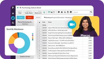
Intuitive data analytics like Phocas can analyze for you and help you easily identify trends, correlations and variances in your data. Business intelligence solutions also have inbuilt visualisations for you to display your data in charts and graphs. Phocas has recently added a new feature combining both numbers and charts to suit audience preference and what you want them to take away from your presentation. No doubt you want to be clear and get them to make the best decision.
To learn more about Phocas visualisation tools, download the Dashboards and Scorecards eBook


Myles is the co-founder and CEO of Phocas.
Related blog posts

Food and nearly everything else that is bought and sold must travel from where it is produced to the buyer. Transportation costs are rising sharply. Oil prices have surged by approximately 45% and gas by 55% since late February, a direct consequence of the escalating conflict in the Middle East. Distributors and their supply chain managers have been up against inflation and rising prices since the pandemic and and to cope with continuing shocks like the Middle East crisis most have had to change their supply chain processes to manage a more volatile marketplace. Business intelligence (BI) helps distributors understand risk exposure and make confident decisions when the range of possible futures runs from bad to considerably worse.
Read more
Sales work doesn’t happen neatly at a desk. It happens in real-time while in the car between appointments, on warehouse floors, in customer offices, over coffee and sometimes after hours when you finally get a moment to log what happened during the day.
Read more
Customer segmentation has been around for decades, but in many organizations, it’s still underutilized. Done right, it’s one of the most powerful tools to help sales teams focus their time and energy, optimize resources and improve the customer experience.
Read more
Picture a football coach preparing for the big game. He watches game‑tape, studying player metrics, analyzing every play and using real‑time stats to inform strategy. That’s exactly how sales managers and sales leaders should approach their coaching program—with a data‑driven approach.
Read moreBrowse by category
Find out how our platform gives you the visibility you need to get more done.
Get your demo today