Turn data into a chart
3 videos in this learning module
Visualize your data in a chart
Configure your chart options
Create KPI-style gauge, summary and bullet charts

3 videos in this learning module
Visualize your data in a chart
Configure your chart options
Create KPI-style gauge, summary and bullet charts
Visualize your data in a chart
Supporting documentation
Configure your chart options
Supporting documentation
Create KPI-style gauge, summary and bullet charts
Supporting documentation
Related learning modules

Phocas Analytics QuickStart

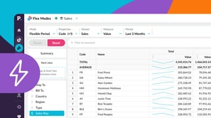
Flex Modes QuickStart
This beginner-friendly module walks you through getting started in Flex Modes and shows you how to run simple analyses for quick insights. Learn how to explore your data with Flex Modes and see how the different modes and features give you the flexibility to view, compare, and analyze your information in ways that work best for you.


