Humans are hard wired to love pictures over written content. It’s why you’ll often gain a better response from stakeholders when different types of data visualization techniques are used over spreadsheets, such as dashboards, bar charts, graphs, infographics and videos.
For finance teams, dealing with complex financial data often means poring over thousands of rows of raw data in Excel spreadsheets. Manually analyzing company data this way is laborious, becoming a chore that is often neglected. However, when the same financial data is consolidated using business intelligence and presented in a visual format —it’s easier to analyze and uncover key insights and share them with the wider business.
What are financial data visualizations?
Financial data visualizations involve the visual representation of financial reports like profit & loss statements, balance sheets and cashflow statements. This enables the finance team to easily analyze the information and share the uncovered trends, exceptions and opportunities. Financial data visualizations transform static month-end statements into compelling stories that decision-makers across the business can understand.
Common types of data visualizations
- Line charts are ideal for showing trends or changes over time by connecting data points with a continuous line. They’re ideal for spotting patterns such as revenue growth or fluctuations in stock prices.
- Bar charts compare categorical data by representing values as rectangular bars, making it easy to identify differences at a glance. They are versatile and can display data horizontally or vertically for clearer interpretation based on the dataset.
- Scatter plots reveal relationships or correlations between two variables by plotting data as individual points on a graph. They are helpful for identifying trends, clusters, or outliers in datasets, such as sales performance relative to marketing spend.
- Heatmaps use color gradients to represent data intensity or frequency, offering a quick way to spot trends or anomalies across dimensions. They are often used for analyzing large datasets, like website traffic or product demand across regions.
- Dashboards consolidate multiple chart types into one view, providing a real-time snapshot of key performance indicators (KPIs). They allow users to monitor and analyze data from different sources in one place for better decision-making.
Why are financial data visualizations useful?
To forecast business performance and track variations against budgeted figures, finance professionals have numerous sources to collect in-depth data. However, finance faces two major problems in analyzing data and collecting financial insights:
- Data is spread across multiple sources; ERPs, HRIS, CRM, disparate spreadsheets – making automation and consolidation critical.
- Processed data needs to be shared with cross-functional teams in a way that's easily understood and that they can use to improve their decision-making processes.
Data visualization lets the finance team convert complex data into smaller chunks and static figures into compelling stories that others can better understand and consume.
With data visualization, finance professionals can easily communicate the financial performance to other people in the organization or educate the rest of the team to look out for certain events, such as when indicators are dropping like the threshold for profit margins. Visual representation in the form of dashboards, bar charts, graphs, maps and other graphics enhance understanding and help people make better decisions that are driven by data, not ‘gut instinct’.
Data visualization also puts endless rows and columns of data, available in multiple sources, on one screen, making it easier for the finance team and others to see whole business performance at a glance.
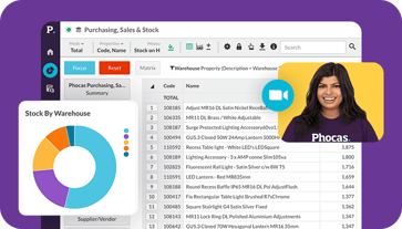
With the help of the data visualization tools, the finance team can build financial dashboards for visual comparison and analysis of KPIs. Depending on your data visualization software provider, dashboard functionality should include the ability to drill down into transactional-level data to answer questions on the fly or to follow your train of thought.
Users can quickly understand and measure data accurately, and in real-time, without affecting the general ledger. Below are some examples of the dashboards that finance teams can build to share data insights people across an organization. helping them make more informed data-driven decisions and to better understand the impact those decisions make on overall business performance:
- Cash Management Dashboard;
- Financial KPI Dashboard;
- Profit and Loss Dashboard;
- CFO Dashboard; and
- Financial Performance Dashboard
How Phocas helps with financial dashboards?
Phocas pulls data from your ERP and other types of data sources into one platform, so everyone has access to one set of up-to-date numbers. Its easy-to-use interface makes it logical and straight forward to create and customize unlimited dashboards, providing a real-time holistic view of financial metrics. The finance team can perform in-depth data analysis with the ability to freely explore any variable, pivot the data, and drill down to transactional level.
Check out our ultimate guide to Financial software, budgeting and analysis

With Phocas doing all the heavy data lifting, the finance team are freed from manually collecting data and filling spreadsheets. Its BI foundation also provides the ability to show financial information alongside other business metrics.
Live dashboards present a snapshot view of financial performance. Users can analyze and track both legal and non-legal entities (branches, areas, departments, product lines, etc.) to measure financial growth.
Instead of simply visualizing data in graphs, pie charts and maps, Phocas provides an array of data visualization tools, features, and systems to give you an unparalleled experience.
You can customize data to meet your needs, present information as you want and access everything, including charts, dashboards, KPIs, data cubes, and reports inside the software.
Even with data all around, it’s hard to know where to start. For Peter Church at FB Chain, Phocas turned overwhelming information into clear direction.
“Right now, I feel like I am in a swimming pool, and I am surrounded by all this information. Phocas gives me all the different strokes I need to effectively use the data. We now have a solution that gives us new and different ways to look at the data, and improve the business, and fortunately, we no longer have to rely on someone’s Excel skills,” says Peter.
Data visualization enables teams to have knowledgeable conversations about financial statements. Financial dashboards ensure that non-financial people can grasp the numbers and educate themselves about data to make informed decisions.
Phocas, as a data visualization tool, connects all pieces of the puzzle and transform business processes, thus becoming a partner to your organization’s growth and success.
To find out more about financial data visualizations, download this ebook: Turbo Charge your finance team with Data Analytics.


Lindsay is an experienced writer with a passion for translating complex content into plain language. Specializing in the software industry, she explains the importance of data access and analysis for all businesspeople, not just the data experts.
Related blog posts


Browse by category
Find out how our platform gives you the visibility you need to get more done.
Get your demo today