A dashboard is a tool that allows you to see at-a-glance the performance of your organization. The various widgets on a dashboard are often charts or gauges which help explain complex information. A new financial statement solution backed by the power of a data analytics toolkit is changing the way finance teams carry out month-end reporting and the built-in dashboards provide more dynamic insight into financial outcomes.
Let’s take a look at a month-end financial dashboard and explain four ways it is improving the review, understanding and interrogation of the numbers in a mid-market business.
1. Charts and tables are easy to reference and spot variances
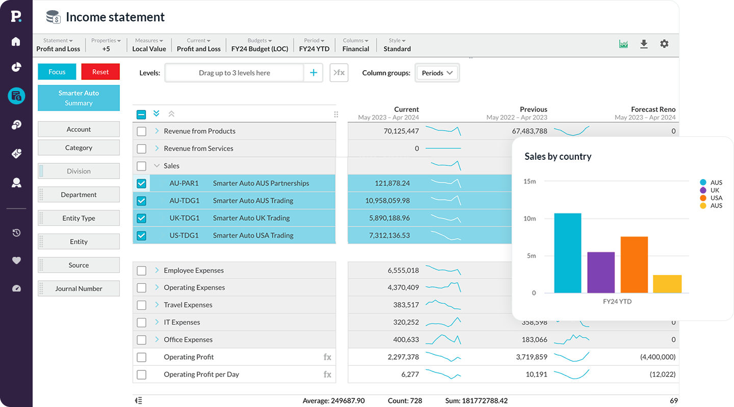
Using a dashboard to showcase the month-end financial reports will help more people in an organization to visualize financial data in the form of charts or graphs. This way is more natural to uncover patterns, communicate insights, and make data-driven decisions. In this example, the headline information is that gross profit is 10% less than budget. To quickly ascertain why this has occurred, you can see that sales are considerably down. Why? The regions where the business operates have been in lockdown for the month as a result of the pandemic, so customer demand dropped significantly.
2. A subset of data can be visualized for regions or branches
The financial statements solution allows users to customize financial statements to suit the set-up of your business. For instance, if you have three regions you operate in, then most likely three different month-ends for each region (be it UK, USA and Australia) are created. The financial statement tool allows you to set-up these reports once and automate them. Stakeholders can review the group performance dashboard as well as filter to the UK to see the dashboard as it specifically relates to the British business.
3. See the big picture
In this dashboard, all the statements (Profit & Loss, Balance Sheet and Cashflow) have been included on one page so you can quickly see an overall snapshot of the business. The statements each serve a different purpose but seeing them all together is what tells the real story of financial health. In this example, profit is significantly down (Profit & Loss), but what does this mean for the cash? ( scroll to Cashflow). To improve the cash position, then you will review the Balance Sheet. You can investigate whether the debtors are being collected fast enough or perhaps you are holding too much stock (which is in the Balance Sheet).
4. Sharable - quickly email marketing the financials and follow-up
More visibility of financial performance through dashboards leads to better conversations between teams by simply having an easier way to visualize the financial statements. A graph seems like fewer numbers (even though it isn’t) than a financial statement. In this example, we can see that advertising costs have gone up despite the dramatic drop in sales. We can create a sales and marketing dashboard to show marketing spend by month vs revenue by month to see conversion rates and ROI. We can also allow marketers to manage their budget by giving them access to what channels and campaigns money has been spent to date.
By using dashboards, more people understand the numbers which leads to an organic education of non-financial stakeholders and a stronger performing business.
Ideally, your financial statements solution will work in tandem with your business intelligence software and ERP to facilitate the sourcing and management of data. Phocas Financial Statements, for example, is an add-on to Phocas business intelligence software and integrates with a variety of top ERP systems such as Infor, Epicor, Microsoft, MYOB, Oracle and SAP.


Empowering businesses with intuitive data analytics, driving informed decisions for growth and profitability. We make people feel good about data.
Related blog posts


Browse by category
Find out how our platform gives you the visibility you need to get more done.
Get your demo today