Individuals have unique ways of perceiving the world around them. This includes how they extract meaning from their data. Some people prefer to see as much information as possible. While others favor a more simplified report. At Phocas, we pride ourselves on offering flexibility. Here are three videos that demonstrate how to customize your data according to your needs.
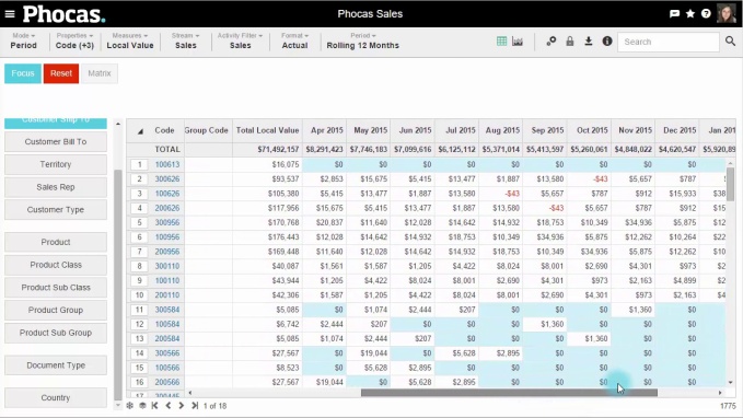
See more by freezing the properties column
A wonderful feature of Phocas is the ability to see all of your data in the grid area. However, having several columns on the screen means there is considerable amount of data to scroll through. Freezing properties such as ‘name’ or ‘territory group code’ enables you to scroll as much as you like without losing sight of important reference data.
In this video, we’ve got our grid view with several properties turned on. As we scroll over to our monthly sales, we lose sight of those properties such as the territory group code. But Phocas offers a simple way to freeze properties by simply selecting the snowflake icon at the bottom of the screen. Now we can scroll over to our monthly sales values without losing our properties.
Better understand your customers in percentage share view
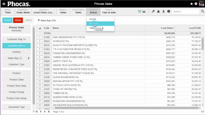
Phocas allows users to change the format to compare profitability to sales value. Switching from actual figures to a percentage share view can reveal discrepancies between sales value and profitability. This will provide a much better understanding of your customers.
In this video we will show you how to compare these measures to find the customers who represent a higher sales dollar rations than they do percentage dollar ratio. We do this by selecting our ‘Bill to’ customers. In the total mode we have selected ‘Sales Value’ and ‘Profit Value.’ But if we select ‘Percentage Share’ under the format drop down menu, we have a much different view of our customers. For instance, we see that while a customer represents 9.97% of the total sales value, they only represent 8.4% of the total profit. Changing the format to ‘Percentage Share’ in Phocas offers a clear view of what customers are actually bringing to the table.
More options for displaying data
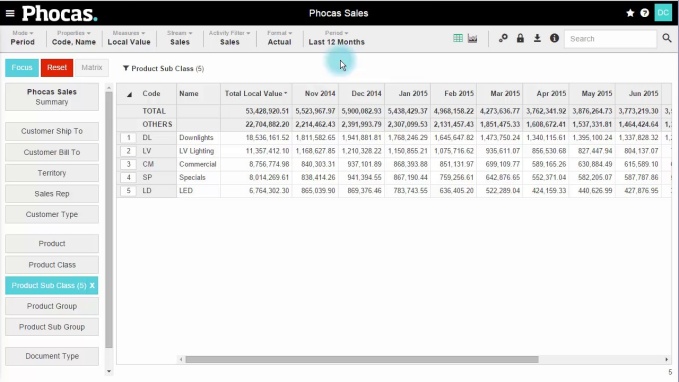
Want another way of looking at your data? In this video, we learn about the ‘Show Others’, ‘Show Average’ and ‘Hide Total’ display options. To begin, we have five product sub-classes selected but by selecting ‘Show Others’ and additional line called ‘Others’ is added. In our example we can see that in addition to the $55million in sales from the selected product sub-classes, we have $22million in sales of other not included on this page.
By deselecting ‘Show Others’ and selecting ‘Show Average’ we can see the average sales for the five selected sub-classes. In our example of $55million, we can see we have an average of about $10million per line. Finally, by deselecting ‘Show Average’ and selecting ‘Hide Total’, we remove the total line from the top of the page for a simplified view of the sales values for our selected sub-classes.
To better understand all the features of Phocas data analytics, book a demo today.


Empowering businesses with intuitive data analytics, driving informed decisions for growth and profitability. We make people feel good about data.
Related blog posts


Browse by category
Find out how our platform gives you the visibility you need to get more done.
Get your demo today