Create KPI-style gauge, summary and bullet charts
3:25 min
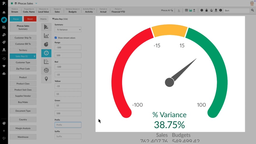
Discover how to track key performance indicators using KPI chart types in an Analytics database. In chart view, explore Gauge, Bullet, and Summary charts to visualize business goals and targets, ensuring performance insights are clear and easy to monitor.
Supporting documentation
 Help & support
 Related video tutorials
Manage favorites, dashboards, and subscriptions
Learn how to manage and share favorites and dashboards with users, and discover how to subscribe them to email notifications to keep them updated on important changes in key data.
3:18 min
Homepage at a glance
Learn how to make the most of your homepage - the starting point to easily find databases, dashboards, favorites and recents.
2:23 min
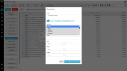
Create a 'low margin' alert
In this video, learn how to build a low margin report using advanced search - and then create a color-coded alert for your dashboard or home page.
3:31 min
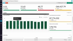
Explore and view dashboards
Discover just how user-friendly a Phocas Financial Statemetns dashboard can be! Learn how to make simple selections, narrow your focus, clear filters, and reset the dashboard with ease.
2:29 min