Turn data into a chart
8:14 minutes total learning time
Switching from grid to chart view opens up options for various graphical presentation of your data. This module covers basic chart setup through to advanced configuration, with a detailed look at some chart types.
Phocas product  Analytics
3 videos in this learning module
1
Visualize your data in a chart
1:22
2
Configure your chart options
3:27
3
Create KPI-style gauge, summary and bullet charts
3:25


3 videos in this learning module
1
Visualize your data in a chart
1:22
2
Configure your chart options
3:27
3
Create KPI-style gauge, summary and bullet charts
3:25
Visualize your data in a chart
Discover how you can use charts to quickly visualize your data and spot trends at a glance. Charts are especially helpful when dealing with large datasets, allowing you to get an easy visual overview without scrolling through endless columns and rows in the grid.
Supporting documentation
Configure your chart options
See how to change an axis starting point (using auto-axis scale), stack the chart values on top of each other rather than side by side or select and focus on a segment.
Supporting documentation
Create KPI-style gauge, summary and bullet charts
Discover how to track key performance indicators using KPI chart types in an Analytics database. In chart view, explore Gauge, Bullet, and Summary charts to visualize business goals and targets, ensuring performance insights are clear and easy to monitor.
Supporting documentation
Phocas product

Related learning modules
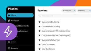
Phocas Analytics QuickStart
This module for beginners takes you through getting started in Phocas Analytics and doing some simple analysis to get fast results from your data. These videos introduce you to features that you will be using every day.
9 videos
19:09 min
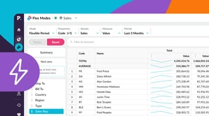
Flex Modes QuickStart
This beginner-friendly module walks you through getting started in Flex Modes and shows you how to run simple analyses for quick insights. Learn how to explore your data with Flex Modes and see how the different modes and features give you the flexibility to view, compare, and analyze your information in ways that work best for you.
6 videos
13:41 min
Grid customization basics
Want another way of looking at things? This module for beginners covers simple methods of customizing your view in the analysis grid.
5 videos
13:22 min