Watchouts for when creating dashboards with AI
Using AI to build dashboards is genuinely fast and getting faster. But there are watchouts that most teams don’t hit until they’ve already shared an AI-generated view with a stakeholder who asks a question the dashboard can’t answer. We hope this checklist will help you know what to avoid and how you can fix the problems.
Why building dashboards with AI is so tempting
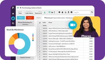
For years, dashboard creation meant relying on a data analyst or an IT person then customized tools like Phocas emerged making dashboards accessible to all. Most mid-market businesses in manufacturing and distribution don’t have a dedicated data team so these intuitive tools have made a huge difference to sales, finance and operations.
There are of course many businesses who don’t have business intelligence tools and so are opting for AI tools as a shortcut to dashboards. Modern AI dashboard generators let you describe what you want in plain language ‘show me weekly sales by product group versus last year with margin highlighted’ and return something that looks like a finished analytics dashboard in seconds.
For quick data analysis or building a one-off view for a presentation, that speed has real value. The watchouts start when teams move from exploration into decision-making and when an AI-generated view becomes the thing people check every morning to run the business.
The 6 watchouts every team should know
Watchout 1: AI can get your metrics wrong without looking wrong
Inaccuracy is the most serious risk of using AI for dashboard creation. Generic AI tools especially those working from uploaded static datasets can miscalculate metrics, apply the wrong date range or confuse a percentage measure with a count. The data visualization looks polished so the error is invisible until someone checks the number against the ERP and the figures don’t match.
The reason this happens is that most generic AI tools work by interpreting your data rather than validating it. There’s no semantic layer enforcing what ‘gross margin’ or stock turns actually means in your business. The AI makes an educated guess and these look identical to correct answers on a bar chart.
The fix: Always validate key metrics against a known source before sharing any AI-generated dashboard with stakeholders. If you can’t trace a number back to a transaction, treat it with caution.
Watchout 2: Your datasets contain outdated numbers without you noticing
Most AI tools that work from file uploads such as CSV and Excel exports reflect the data at the time of the upload.
For interactive dashboards that teams check regularly such as inventory levels, sales pipeline and cash position using stale data sources can lead to incorrect decisions. A purchasing manager who acts on last week’s stock data can easily over-order or under-order based on what the dashboard shows rather than what’s in the warehouse.
The fix: For any dashboard used in ongoing workflows, your AI dashboard needs a live connection to your ERP or data warehouse rather than a static file. That means choosing tools with direct integrations or automatic updates via APIs.
Watchout 3: Everyone builds their own version of the truth
One of the underestimated risks of making AI dashboards accessible to all is that everyone has one. Your commercial manager creates a margin dashboard from one export. Your finance controller builds a revenue summary from another. Your sales leader pulls their own pipeline view. All three use slightly different data sources, different date logic and different definitions of the same KPIs.
Now you have three dashboards, three sets of summaries and no single answer to the same questions. This is a problem that spreadsheets already created and AI tools accelerate significantly because the dashboard creation barrier is so low.
The fix: Standardize metric definitions once, in a governed data model, before you build anything. In a purpose-built BI tool like Phocas, gross margin means the same thing on every dashboard and for every user because it’s defined at the data layer, not in each individual view.
Watchout 4: The layouts look great but you can’t drill down into the detail
Generic AI tools are genuinely strong at producing clean layouts with well-formatted tables, clear graphs and bar charts that make sense at a glance. The problem is that most of them stop there. When a stakeholder asks ‘which customers are driving that margin drop?’ the dashboard has no answer. There’s no drill-down. What you see is what you get.
Operational decision-making in manufacturing and distribution rarely stops at the first layer. A weekly KPI summary prompts questions. Those questions need the ability to filter by location, by product group, by customer to follow the thread from a metric on a screen all the way down to an individual transaction. Without that drill-through, the dashboard becomes a conversation starter but without resolution.
The fix: Before committing to any AI dashboard tool for regular use, test whether you can drill down from a summary number to the underlying detail. If you can’t, it’s a reporting snapshot not an operational tool.
Watchout 5: There are no guardrails on who sees what
When someone builds an AI dashboard from a full ERP export and shares the link, there’s no access control. A regional manager might see figures from another region. A sales rep might see customer margin data that’s commercially sensitive. An IT manager’s governance concerns about data security are well-founded here and generic AI models weren’t designed with role-based permissions in mind.
For businesses with multiple locations, multiple sales territories or sensitive supplier and financial data, this isn’t a minor issue. It’s a data governance problem that gets harder to unwind the longer uncontrolled dashboards are in circulation among stakeholders.
The fix: Any AI dashboard tool used for regular business reporting needs role-based access controls built in so you define who can see what before the first dashboard goes live. These access controls mean people only see what they need.
Watchout 6: The learning curve is hidden inside the output
The promise of natural language querying is that anyone can ask a question and get a chart. The reality is that getting consistently useful output from an AI dashboard tool takes more skill than it looks. Poorly structured prompts return cluttered layouts with too many charts and no clear hierarchy. Ambiguous column names in your source data confuse the AI assistant. Slight differences in how you phrase a question can return completely different outputs.
This learning curve doesn’t show up immediately but it shows up three weeks in, when a team member generates a dashboard that shows the right charts but the wrong time period, or includes KPIs that don’t map to how the business actually measures performance.
The fix: Invest time upfront in structuring your raw data well, agreeing on the questions each dashboard needs to answer, and building a prompt library your team can reuse.
What good AI-assisted dashboard creation looks like
None of these watchouts mean you should avoid using AI to build dashboards. The best analytics platforms today like Phocas combine a governed BI foundation with direct ERP integration, validated metrics, drill-down to transaction level with AI-powered layer on top to help non-technical users get to answers faster.
In practice, that means being able to ask a question in natural language and have the AI assistant return a chart or a summary grounded in your actual business data, not inferred from a spreadsheet upload. The automation refreshes dashboards on a live schedule so your team isn’t working from last week’s numbers. The data visualization allows anyone in the business to interact with by filtering into the source data by location, product and customer.
When AI works within a governed data environment, the six watchouts above stop being risks and start being solved problems. The speed of natural language querying combines with the accuracy that operational decision-making requires. Your finance team gets faster answers. Your ops team gets live visibility. And your stakeholders stop getting different numbers depending on who they ask.


Katrina is a professional writer with a decade of experience in business and tech. She explains how data can work for business people and finance teams without all the tech jargon.
Related blog posts

If you've been paying attention to the data analytics space lately, you've probably noticed a new term emerging into conversations that used to be dominated by business intelligence (BI) and that’s decision intelligence (DI).
Read more
Artificial intelligence is changing the way finance teams can approach financial reporting. From automating repetitive tasks to analyzing financial statements, AI-powered tools promise faster and more efficient financial reporting processes. The use of AI in finance to create common reports like balance sheets, cash flow statements or for more specific tasks like performance analysis dashboards can offer significant benefits. Yet along with the benefits of AI come some known issues.
Read more
You already have an analytics platform. Your data is connected, your team uses it daily and you're getting real value from it. But AI is everywhere and someone in your business is asking the question: do we still need this, or can we just use AI instead?
Read moreBrowse by category
Find out how our platform gives you the visibility you need to get more done.
Get your demo today